Landing Page Anatomy: 9 Essential Elements That Convert
Olumide Ojelere
Autor
Your website tries to do many things at once. It introduces your brand, shows your work, answers questions, and offers several paths for visitors to explore. A landing page does the opposite. It exists for one purpose: to turn a visitor into a subscriber, a lead, or a customer through a single, focused offer.
If you sell products, run sessions, teach a course, or promote an event, a good landing page is often the most important page you will build. In this guide, we break down what a landing page is, why it matters, and the nine elements that help it convert.
What is a landing page?
A landing page is a standalone page built around one offer. You may also hear it called a lead capture page or a post-click page. Visitors usually arrive after seeing something that points them there, such as:
- An email campaign
- A social media post or ad
- A search result, paid or organic
- A banner, pop-up, or blog post on your own site
No matter where they come from, everyone lands on the same page, and that page has one job: explain the offer, show why it is worth it, remove doubts, and invite the visitor to take the next step.
Why landing pages are worth building
A landing page is more than a one-time transaction. It is often a person's first real interaction with your business, so it is your chance to make a strong impression and start a relationship. Every email address, booking, or purchase you collect here becomes the beginning of your marketing funnel, the place where you can follow up, nurture interest, and sell again later.
That is why the structure of the page matters. Each element either builds trust or adds friction. Here are the nine that matter most.
1. A stripped-down header
A landing page should keep attention on one thing, so the header should stay quiet. Skip the long navigation menu. A logo, and perhaps a small menu icon linking back to your homepage, is plenty.
Every extra link in the header is an invitation to leave. By removing competing options, you decide where the visitor's attention goes from the first second.
2. An enticing hero section
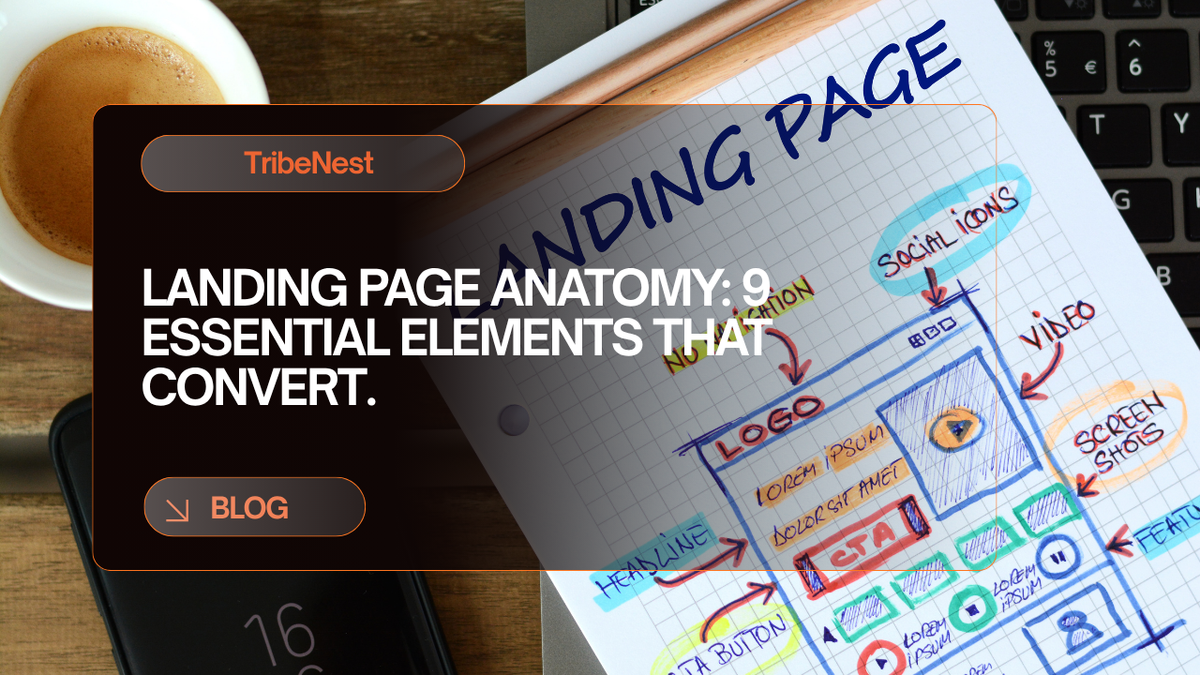
The hero is the first thing visitors see, and it has to earn their attention fast. A strong hero usually has four parts:
- Headline: State your core value in a short, clear line. Make it the largest text in the section so it cannot be missed.
- Description: Add one or two sentences on what the visitor gains. Keep it brief, because the rest of the page does the explaining.
- Imagery: Use a photo, illustration, or video that supports the offer. A product shot, a short clip of your service in action, or a clean visual of the result works well.
- Call-to-action (CTA): Put your main button here, with wording that tells people exactly what happens when they click, like "Buy now" or "Book a session."
3. Benefits-driven content
How much copy you need depends on how familiar people are with you. A new brand usually needs more explanation than a well-known one. Whatever the length, keep these principles in mind:
- Be clear and concise. Drop the jargon and keep sentences short.
- Answer "What's in it for me?" Lead with what the visitor gets, not a list of features.
- Guide the reader. Use headings, spacing, and a clear visual hierarchy so scrolling feels effortless.
This is also where your personality can show. You do not need to be flashy. A distinctive line of copy or one memorable visual can be enough to make your page stick in someone's mind.
4. Supporting imagery
Every image should earn its place. If it does not reinforce the text or add context to your story, leave it out.
Choose images that match the offer. A fitness coach is better served by a photo of a real workout than an abstract graphic. A perfume brand should show the bottle and the mood it creates. If you use AI to generate visuals, treat it as a starting point and make sure the final result still feels like you.
5. One CTA, repeated
Your website can offer many actions. Your landing page should offer one. When visitors have a single clear choice, they are more likely to make it.
Repeat that same button at natural points down the page: in the hero, after the benefits, near the testimonials, and at the end. Someone who is convinced halfway down should not have to scroll back up to act.
6. An intuitive form
If your goal is to capture leads or sign-ups, a form is the heart of the page. To keep it friction-free:
- Ask only for what you truly need
- Label every field clearly and mark the required ones
- Make fields large enough to tap easily on a phone
- Add a short heading that explains what the form is for
- Tell people what happens next after they submit
- Show helpful error messages right next to the field that needs fixing
Where the form lives depends on your audience. For visitors who are ready to act, placing it near the top removes hesitation. For people who need to read first, put it further down the page or link to it from your CTA.
7. Social proof
People trust other people. Testimonials, reviews, and customer stories show that others have taken the leap and been glad they did. For social proof to work, it has to be real. Include the customer's name, add a photo if you can, and share specific results. Photos and posts from happy customers can be just as persuasive.
8. FAQs that remove doubt
By the time a visitor reaches the bottom of your page, any lingering questions can stop them from acting. An FAQ section answers those questions before they become reasons to leave. It also shows that you understand your customers' worries. Think about what people ask about price, delivery, refunds, timing, or how the process works, and answer those directly.
9. A minimalist footer
Just like the header, the footer should stay simple. Stick to the essentials:
- A link to your Privacy Policy
- A link to your Terms
- Your logo
- A copyright line
Anything more gives visitors another way to wander off before converting.
Best practices to help your page convert
Once the structure is in place, these habits help every element perform better:
- Match the message. Your headline should echo the ad, email, or post that sent people there, so they know immediately they are in the right place.
- Design for mobile first. Many visitors arrive from social media or email on their phones, so check that your headline, form, and button look good on a small screen.
- Keep it fast. Compress images and avoid heavy elements. Every extra second of loading gives people a reason to leave.
- Put trust signals near the CTA. A short testimonial, a guarantee, or a secure-payment note beside your button can reassure people at the moment they decide.
- Test one change at a time. Try a different headline, image, or button label, compare the results, and keep what works.
Build your landing page on TribeNest
A landing page is only as useful as the business behind it. With TribeNest, your website, checkout, bookings, memberships, email, and invoices all work from one shared customer list, so the people who sign up on your landing page flow straight into the rest of your business instead of getting lost between separate tools.
You can also start from one of our ready-made business templates, which open with a website, products, and prices already set up. And because TribeNest charges a flat subscription with 0% commission, you keep every sale you make. Payments go directly to your own Stripe or Paystack account.
Ready to put these nine elements to work? Start your business on TribeNest with a free trial, no card needed.
Olumide Ojelere
Geschrieben von